Many investors will know technical analysis has become an increasingly important part of stock analysis, but they may not know how to read stock charts. Those investors need not fear – we have compiled this guide to technical analysis so you may be able to know what technical traders are watching for, and perhaps integrate it into your own stock analysis.
You will have noticed that at Stocks Down Under, we use Technical Analysis quite a bit. However, we’d like to point out that we don’t use technical analysis just by itself. We use it in conjunction with fundamental analysis to come up with more accurate forecasts of stock price movements. Some investors may just ‘day trade’ and be successful (or not). Ultimately, it is up to individual investors to determine their strategy, although it can’t hurt to at least have some idea as to how other investors are going about it.
There are four sections we cover:
- Sentiment and Stop losses
- Candlestick charts and price action
- Price trends and trend reversals
- Momentum Indicators
But first…
What is technical analysis and why is it used?
Technical analysis is essentially ‘reading stock charts’. You’re not looking at a company’s accounts, its most recent investor relations slide deck or even WallStBets or HotCopper. You’re just looking at the company’s share price chart and trying to judge which way the share price is going to do based on the past.
The purpose of using technical analysis is to make a more informed assessment of sentiment on a stock than fundamental investors. Because sometimes, they can be wrong and the market can see surprising news either way.
Technical analysis can sometimes signal coming news for a stock before the news is announced to the public. This is because there are always better-informed investors who can see things happening with a stock before the rest of the market does. Thus, they begin to act on their information and their buy or sell activity changes the stock chart. A technical analyst can read these signals on the charts and act before the news come out and a significant change to the share price occurs. But how? We’ll seek to address this.
Sentiment and stop losses
Sentiment
If you have any experience with financial markets, you probably have heard of “Bulls and Bears” or “Bullish Market or Bearish Market.” What this terminology refers to is actually the sentiment on the market or on a particular stock or any individual financial asset.
Bearish sentiment on a stock means market participants overall are pessimistic about the stock and this pessimism is likely to drive the stock price lower. On the other hand, Bullish sentiment on a stock means market participants overall are optimistic about the stock and, consequently, we can expect this optimism to continue to drive the stock price higher.
There are certain technical analysis tools that allow us to read the sentiment on a stock. These tools include price trends, moving averages, price action and momentum indicators, such as MACD. We will introduce you to some of these tools in upcoming articles.
Now imagine that you buy a stock based on fundamental analysis alone without paying any attention to the market’s bearish sentiment on the stock. What will happen in most cases is that the market keeps beating down the share price while you are thinking you’re holding a hidden gem that fools on the market are selling for cheap prices, whereas the only thing that is going up is losses in your account.
What are Stop Loss and Take Profit levels?
Whenever you open a position on a stock, whether long or short, it is important to have a plan that’s tells you what to do when the share price moves away from your entry level. If the share price moves in your favour, you’ll need to know a price level at which to a take profit before the price starts to reverse. This level is called a take profit level. On the other hand, if the share price moves against your position, you’ll need to know a price level at which to stop your losses to limit the damage to your account. This level is called a Stop Loss level.
Technical analysis gives you more flexibility regarding risk management. You can use it to determine price levels below which you will sell your stock and stop your losses because if the stock price goes below those levels, from a technical analysis point of view, the chances of further declines will increase.
Similarly, when the stock price moves in your favour, technical analysis will tell you at what levels there will likely be high profit-taking pressure, which may drive the share price lower. This insight will allow you to take profits at more attractive prices.
Candlestick charts and price action
What are candlestick charts?
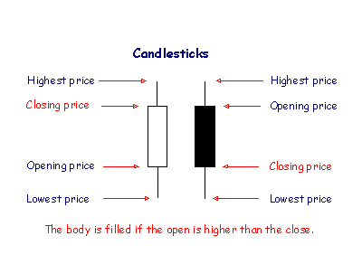
Candlestick charts are widely used in technical analysis and were first introduced by the Japanese in the 1700s. Candlestick charts are constructed by the four most important elements in price information – the high, low, open and closing price – during a chosen time frame (hourly, daily, weekly, …) using a body and two wicks.
In a chart with a daily timeframe, each candle represents the lowest traded price on that day by its lower shadow and the highest traded price by its upper shadow. If the stock closed higher than it opened, the body of the candlestick is white, with the opening price at the bottom of the body and the closing price at the top. If the stock closed lower than it opened the body is black and the top of the body shows the opening price and the bottom of the body shows the closing price.
If you’ve been following Stocks Down Under for some time, you probably have noticed that we use candlestick charts for all our stock price charts. This is because we find candlestick charts to be the most effective in visualising important price points and the behaviour of the market during each session. This is particularly important when monitoring the price behaviour following an important inflection point, such as a breakout.
Price action in technical analysis
After the price breaks out of a pattern or a trendline, we closely monitor the forming candlesticks following the breakout to assess the validity of the move. Particular sequences of candlesticks form various candlestick patterns which are the cornerstone of price action – a form of technical analysis that incorporates the behavioural analysis of market participants as a crowd from the evidence demonstrated in price movements.
There are numerous candlestick patterns discussed in the technical analysis literature, but here we discuss a few of them that we have found the most effective in the stock market.
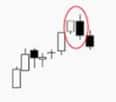
Bullish Engulfing
This candlestick pattern is formed by two candlesticks, a black body candle in a downtrend that is engulfed by a following white candle. It is a signal of strength on the side of buyers and starts below or at the close of a black candle and pushes the price above the high of the black candle.
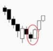
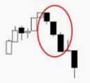
Bearish Engulfing
Similar to the bullish engulfing pattern, but in the exact opposite manner. A white body candle in an uptrend which is engulfed by a subsequent black candle. The lower the black candle goes, the bigger the shift to bearish sentiment is.
Three white soldiers
This candlestick pattern consists of three white candles each closing higher than the previous day. This pattern signals high conviction on the side of buyers and it’s a strong bullish signal.
Three black crows
This candlestick pattern consists of three consecutive black candles each closing lower than the previous day. This pattern signals high conviction on the side of sellers and it is interpreted as a strong bearish signal.
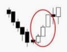
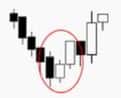
Three inside up
A three-candlestick pattern that appears at the end of a downtrend and is composed of a small white candle preceded by a large black candle and followed by a large white candle that closes above the black candle. The small white candle signals weakening selling pressure while the following strong white candle signals that the bulls are getting control of the price.
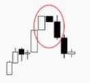
Three inside down
Similar to the three inside up pattern, but in an opposite manner. A small black candle that is preceded by a large white candle and followed by a large black candle that closes below the white candle. It signals a shift in the sentiment to bearish.
Price trends and trend reversals
Uptrends and downtrends
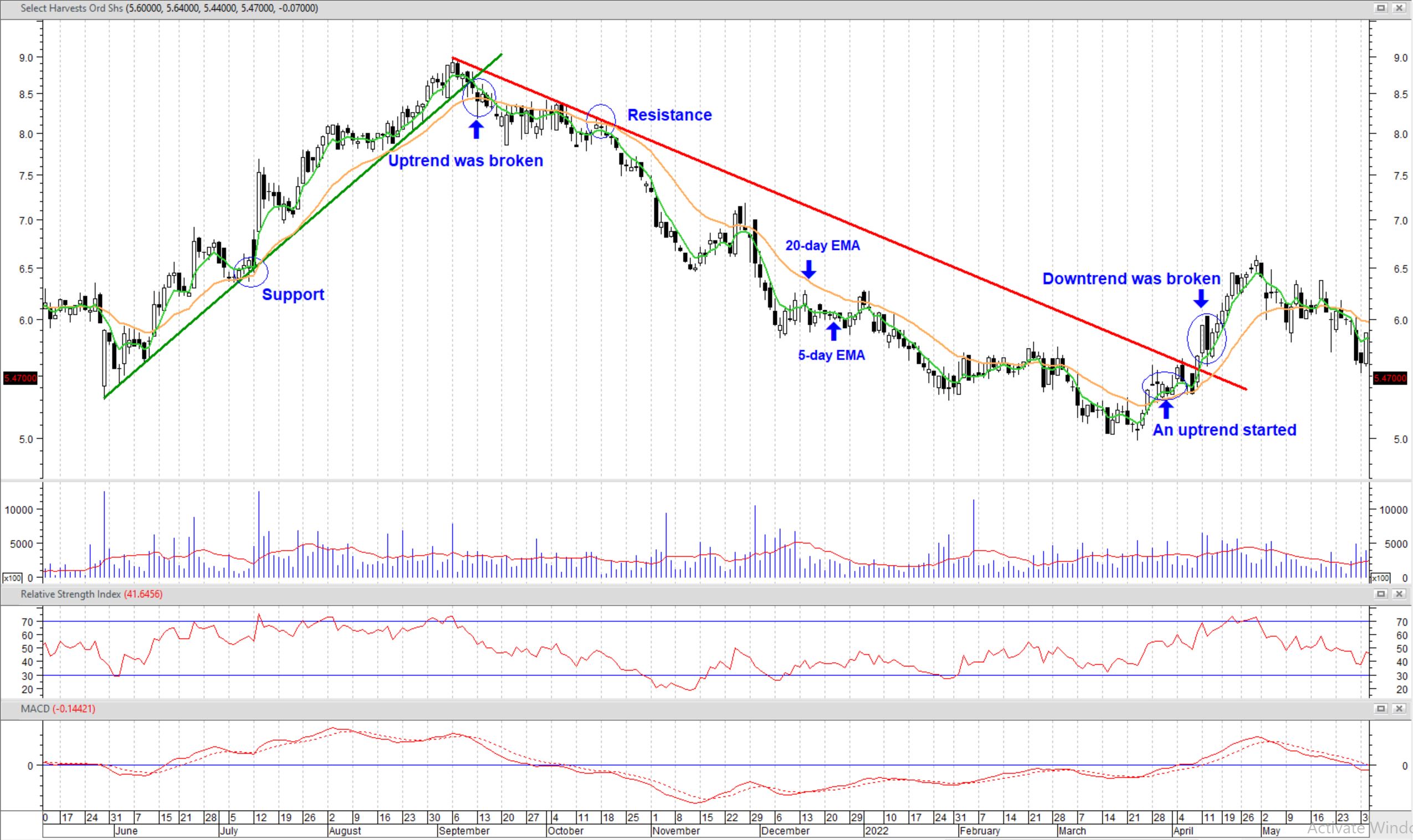
When a stock price is experiencing higher highs and higher lows, we say that the stock’s price is on an uptrend and we should be able to draw an upward trendline on the price chart by connecting the ascending lows (see the left side of the chart below).
The fact that the market could push the price above previous highs, where there’s natural profit-taking activity, is an indication of enthusiasm on the side of buyers and signals a bullish sentiment on the stock. On the other hand, when a stock price is experiencing lower lows and lower highs, we say that the stock is on a downtrend and we should be able to draw a downward sloping trendline on the price chart by connecting the descending highs (see middle section of the chart below).
With a similar interpretation used for uptrends, but in an opposite manner, the fact that sellers can overcome the natural bargain buying pressure at the lows and push the price even lower shows us the higher enthusiasm on the side of sellers compared to enthusiasm on the side of buyers of this stock and it signals a bearish sentiment on the stock.
The following chart shows how to draw trendlines and find trend reversals.
Finding trend reversals
The reason why we use higher lows in an uptrend and lower highs in a downtrend to draw the trendlines instead of higher highs and lower lows is that we are interested in using trendlines to find potential trend reversals and support and resistance levels. When we find the trend on a stock price, the presumption is that the trend tends to last until the price breaks the trendline.
Therefore, a strategy to use price trends to make trading or investment decisions is to draw the trendline and in an uptrend to buy the prices near or at the trendline and sell when the uptrend breaks, i.e. when the share price falls below the trendline. Similarly, in a downtrend sell at the prices near or at the trendline and buy when the downtrend breaks.
Nothing is set in stone
Be aware that trendlines only suggest Potential support or resistance levels. It is important to know that these levels are only indicative of a potential for the price to return back to the direction of the trend and there’s no certainty. Whenever the price reaches the trendline there will be two possible scenarios for the next move in the price.
The first one is the default scenario that the price has not yet reached the equilibrium level where there will be a balance of enthusiasm between buyers and sellers. In this case the price will return to the direction of the prevailing trend and continues to move in the direction of the trend.
The second share price scenario after reaching the a trendline is to break through the trendline. This will be an indication of a pause in the trend and a possible trend reversal.
Moving averages and price trends
Moving averages are more commonly used in trading algorithms to find price trends. This is because moving averages are calculated by using simple mathematics whereas finding trendlines on a chart will require advanced machine learning algorithms and image recognition technologies, which makes the process inefficient for many algorithmic trading strategies.
A simple moving average (SMA) is calculated by taking the arithmetic average of a set of prices during a given number of trading sessions. An exponential moving average (EMA) is a weighted average of the same prices with a higher importance given to the more recent prices and therefore it’s more responsive to the changes in the price.
5, 10, 20, 50, 100 and 200 days are the most commonly used periods to calculate moving averages. The choice of the time periods depends on the trader’s investment horizon and the overall strategy. Shorter time periods are used for short-term trading and longer time periods are used for long-term investments.
Using moving averages to find trend reversals
Crossovers of two moving averages are used to find reversals in price trends. If a short-term MA crosses above a longer-term MA and remains above that MA for at least three trading sessions, an uptrend has begun and if the opposite happens, a downtrend has started.
We use 5-day and 20-day EMAs most commonly as we have found the signals produced by these EMAs to be best-suited to our investment horizon and decision-making process. You can see on the Select Harvest chart above that the 5-day and 20-day EMAs crossovers signalled the start and the end of the trends at about the same time as the trendlines. We can become more confident in the validity of a trend or change in the trend when signals from moving averages and trendlines confirm each other.
Momentum Indicators
Momentum indicators in technical analysis are used to measure the direction and magnitude of price movements. Steeper and longer price swings represent stronger momentum and shallow slope and short price swings represent weaker momentum. Momentum indicators quantify price movements’ strength and make comparisons between different price movements possible.
Relative Strength Index (RSI) and Moving Average Convergence Divergence (MACD) are two of the most popular momentum indicators amongst technical analysts. You can always find them in the bottom of our stock charts in our technical analysis insights articles.
Relative Strength Index (RSI)
The RSI indicator shows the relative size of gains in the price versus losses over a given period, usually 14 days. RSI uses a smoothing function in its formula to return readings only between 0 and 100, the higher the reading, the more bullish the momentum in the price is and vice versa.
An RSI reading above 70 indicates an overbought condition and it’s a sign that buyers have bid the price up too quickly and increases the chances of corrective pullbacks in the price. On the other hand, an RSI reading below 30 indicates an oversold condition and it’s a sign that sellers have bid the price down too fast. It increases the chances of a price reversal or corrections in the price.
Moving Average Convergence Divergence (MACD)
The MACD indicator consists of two lines, the MACD line and the MACD signal. On the default setting, the MACD line is calculated by subtracting the 26-day exponential moving average (EMA) from the 12-day EMA. The MACD signal is a 9-day EMA of the calculated MACD line. Too complicated? Don’t worry. This is what you need to know:
A MACD line above both zero and the MACD signal is a sign of bullish sentiment on the stock. A MACD line crossing below the MACD signal would be an initial sign of a potential trend reversal. If the MACD line continues downwards and crosses below zero as well, then we can say that the sentiment on the stock has shifted from bullish to bearish.
The opposite is also true. A MACD line below both zero and MACD signal is a sign of bearish sentiment on the stock. But a MACD line crossing above the MACD signal would be a sign of potential emerging bullish sentiment on the stock. If the MACD line keeps ascending to cross above zero as well, then the indicator is telling us that the sentiment on the stock has shifted from bearish to bullish.
You can find the RSI and MACD indicators in the bottom of the following chart.
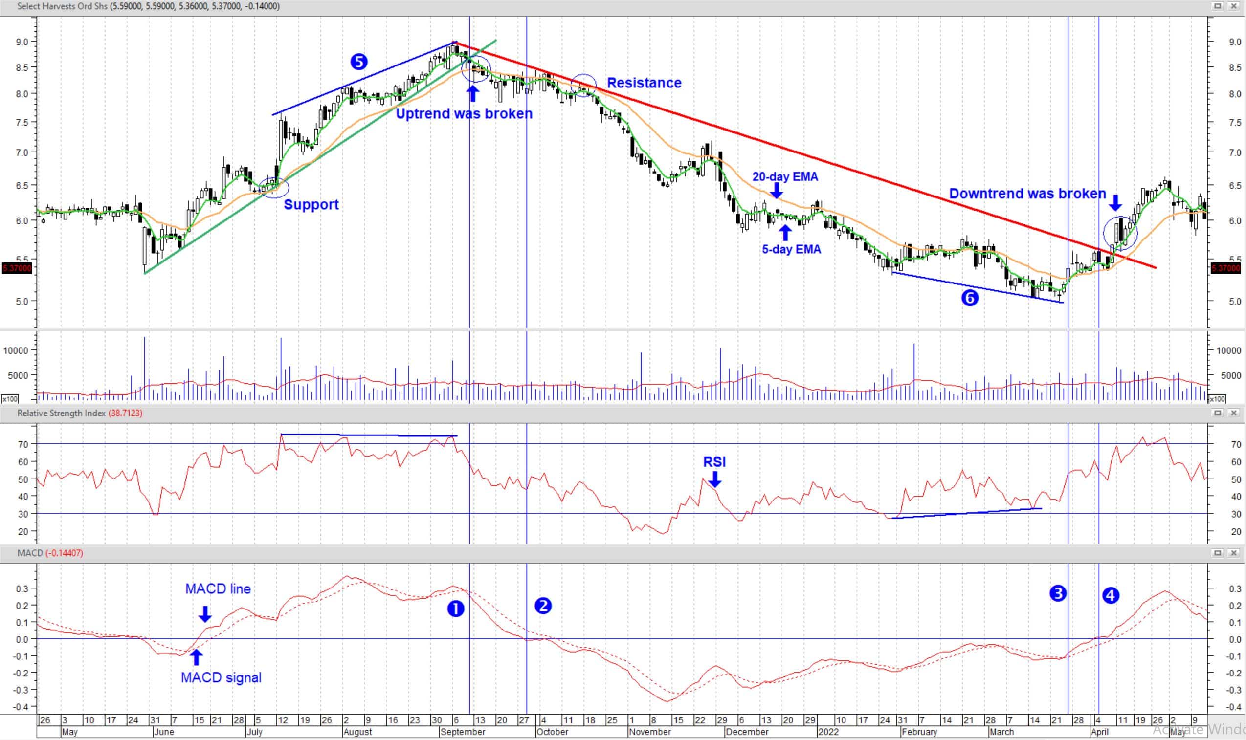
❶ MACD line crosses below MACD signal, at the same time that the uptrend breaks.
❷ MACD line crosses below zero as well, signalling bearish sentiment on the stock.
❸ MACD line crosses above MACD signal, at about the same time as the 5-day EMA crossing above the 20-day EMA.
❹ MACD line crosses above zero as well, shortly before the downtrend breaks.
❺ Price makes higher highs but the RSI fails to make higher highs, indicating price-momentum divergence at the end of the uptrend.
❻ Price makes lower lows but the RSI makes higher lows, indicating price-momentum divergence at the end of the downtrend.
Notice how different indicators confirmed each other with some small differences in timing. It is always a good idea to wait to see confirmation amongst different indicators to obtain more certainty on the shift in sentiment.
Momentum Divergence
When momentum indicators disagree with the share price, a divergence has occurred. We normally use RSI as the momentum indicator for finding divergences. In an uptrend a divergence has occurred when the price makes a higher high, but RSI does not. It is a sign that the bulls are running out of steam.
This, however, by itself does not grant a trend reversal, but it is an early indicator and has important implications for trade management, such as taking partial profits or being more cautious when deciding to buy once the price retraces to the trendline. Point 5 on the Select Harvest chart shows an instance of a momentum divergence in an uptrend.
In a downtrend, a momentum divergence has occurred when the price makes a lower low, but RSI does not, and it’s sign that the bears are losing their enthusiasm to sell. This can be a sign for a temporary pause in the selling pressure or the beginning of a more significant shift in sentiment.
After detecting a momentum divergence, we can begin to monitor the other technical patterns and indicators that we have so far introduced you to in previous Technical Analysis articles (trendlines and moving averages, price action, MACD, …) for an early detection of a reversal in the trend.
Markets don’t always trend
It is important to note that signals from basically all technical indicators are the most reliable when the price is trending up or down and that they are less reliable in range trading and during choppy markets. Historically markets only trend about 30% of the time. Therefore, it is important to familiarise yourself with the price behaviour during ranging and choppy markets and the implications for making trading and investment decisions.
How to read stock charts? This is how
We hope this guide has given you an introduction to technical investing. As with fundamental investing, it is important to do research and not invest any more than you are willing to lose. However, some of these tools may give you an advantage over investors who only rely on fundamental investing.